
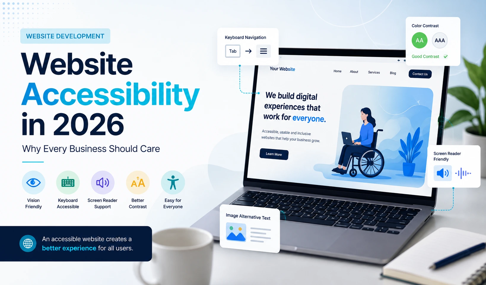
A modern website should work for as many people as possible.
Businesses often focus on design, speed, mobile responsiveness and search visibility, but one important part of website quality is still frequently overlooked: accessibility.
Website accessibility means designing and developing digital experiences so people with different abilities can navigate, understand and interact with them effectively.
In 2026, accessibility is becoming an increasingly important part of professional web development. The Web Content Accessibility Guidelines, commonly known as WCAG, provide internationally recognised recommendations for making digital content more accessible. WCAG 2.2 is the current version of the standard.
But accessibility is not only about meeting standards.
A more accessible website can also create a better experience for everyday users, including people browsing on mobile devices, older visitors, users with temporary injuries and people navigating websites in difficult environments. W3C specifically notes that accessibility can improve user experience, strengthen brands and extend market reach.
What Is Website Accessibility?
Website accessibility is the practice of removing barriers that make it difficult for people to use websites and digital applications.
These barriers can affect users with visual, auditory, physical, cognitive, speech or neurological disabilities. WCAG is designed around making digital content more perceivable, operable, understandable and robust for users with different needs.
In practical terms, an accessible website might include:
- Clear heading structures
- Readable typography
- Good colour contrast
- Keyboard-friendly navigation
- Alternative text for important images
- Clearly labelled forms
- Captions for video content
- Visible focus states
- Descriptive links and buttons
- Logical page structures
Many of these improvements benefit everyone, not only users who rely on assistive technologies.
Why Website Accessibility Matters in 2026
The role of websites has changed significantly.
Customers now use websites for shopping, bookings, enquiries, payments, account management, education and customer support.
When a website is difficult or impossible for someone to navigate, the business may be excluding a potential customer before that person has even had the opportunity to understand the product or service.
Accessible design therefore affects more than technical compliance.
It can influence:
- User experience
- Brand perception
- Customer trust
- Audience reach
- Website usability
- Conversion opportunities
Accessibility standards are also receiving greater attention internationally. WCAG 2.2 has now been approved as an ISO standard, strengthening its role as an international reference point for accessible digital experiences.
1. Use Clear and Logical Heading Structures
Headings help users understand how information on a page is organised.
A page should normally have one clear primary heading followed by logical subheadings.
For example:
H1: Website Development Services
H2: Our Development Process
H3: Discovery and Planning
H3: Design and Development
This creates a predictable structure for visitors and can make content easier to navigate with assistive technologies.
Avoid selecting heading levels purely because of how large or small they look.
Heading structure should represent the hierarchy of the content.
2. Make Text Easy to Read
A stylish website is not effective if users struggle to read it.
Good typography should provide enough:
- Font size
- Line height
- Letter spacing
- Contrast
- Space between sections
Very thin fonts, tiny text and low-contrast grey typography may look minimal, but they can create unnecessary usability problems.
WCAG includes specific contrast recommendations intended to make text easier to distinguish from its background.
3. Provide Alternative Text for Images
Alternative text, commonly called alt text, provides a text description of an image when that image communicates meaningful information.
For example, instead of:
a useful description might be:
Dashboard showing monthly website traffic growth
Decorative images generally do not need detailed descriptions.
The goal is not to stuff keywords into image descriptions. The goal is to provide meaningful context where the image contributes information.
4. Make Websites Usable With a Keyboard
Not every visitor navigates using a mouse or touchscreen.
Important website functions should therefore be accessible using a keyboard.
Users should ideally be able to:
- Move through navigation menus
- Select buttons
- Complete forms
- Open interactive components
- Close modal windows
- Access essential functionality
Keyboard accessibility remains an important principle of accessible web design.
5. Design Accessible Forms
Forms are often one of the most important conversion points on a website.
Unfortunately, they are also a common source of usability problems.
A professional form should clearly communicate:
- What information is required
- Which field a label belongs to
- What went wrong if validation fails
- How the user can correct an error
- What happens after submission
Avoid relying only on placeholder text instead of proper field labels.
Error messages should also explain the actual problem rather than simply displaying something vague such as:
“Invalid input.”
6. Avoid Low-Contrast Design
Modern websites frequently use muted colours, gradients and subtle visual styles.
These can look excellent when implemented carefully, but text still needs to remain readable.
For example, placing light-grey text over a white background may create a visually elegant design while making the content difficult to read.
A 2026 study examining hundreds of prominent websites found that colour contrast failures remain widespread, reinforcing that this continues to be a practical accessibility issue.
Design should not force users to struggle to understand basic content.
7. Make Interactive Elements Easy to Identify
Users should be able to tell what they can interact with.
Buttons should look like buttons.
Links should be recognisable.
Selected elements should have visible states.
Interactive components should not depend entirely on subtle colour changes that some users may not notice.
Consistency is important as well.
If one button style represents a primary action on one page, using the same design language across the website makes the interface easier to understand.
8. Add Captions and Alternatives for Multimedia
Video has become a major part of modern website content.
Where spoken information is important, captions can make that content accessible to users who cannot hear the audio or who are browsing without sound.
Captions are also useful in everyday situations such as:
- Public transport
- Offices
- Quiet environments
- Noisy locations
Accessibility improvements often improve convenience for a much wider audience.
9. Build Responsive, Mobile-Friendly Interfaces
Accessibility and responsive design often work together.
Visitors may increase text size, zoom the browser or use smaller devices.
A well-designed website should adapt without causing:
- Overlapping content
- Hidden buttons
- Horizontal scrolling
- Broken navigation
- Unusable forms
Responsive design should therefore be tested beyond just common desktop and mobile resolutions.
10. Do Not Depend on Accessibility Overlays Alone
Automated accessibility tools can identify useful issues, but they do not replace thoughtful design, development and testing.
Some accessibility problems require human judgement.
For example:
- Is the navigation logical?
- Does the alt text actually describe the image?
- Can a keyboard user complete the entire checkout?
- Does a screen-reader user understand the form error?
- Is the content easy to understand?
Current accessibility discussions increasingly emphasise treating accessibility as part of the design and development process rather than trying to add it afterwards.
Accessibility Is Good UX
One of the biggest misconceptions is that accessibility requires creating a completely different type of website.
In reality, many accessibility principles are simply examples of good user experience.
Clear navigation benefits everyone.
Readable text benefits everyone.
Well-labelled forms benefit everyone.
Fast, responsive layouts benefit everyone.
Logical information architecture benefits everyone.
That is why accessibility should ideally be considered during the initial design and development process rather than treated as a final checklist before launch.
Does Every Website Need to Meet WCAG 2.2?
The legal requirements affecting a website depend on factors such as the organisation, sector and jurisdiction.
Businesses should therefore avoid assuming that one legal requirement applies universally.
However, WCAG provides a widely recognised technical framework for improving accessibility, and W3C describes it as an international accessibility standard.
From a web-development perspective, following accessibility best practices is valuable even when a specific compliance requirement does not apply.
A Simple Website Accessibility Checklist
When reviewing a website, start with these questions:
Content
- Are headings structured logically?
- Is text readable?
- Do meaningful images have appropriate alt text?
Navigation
- Can key areas be accessed using a keyboard?
- Are buttons and links clearly identifiable?
- Is the navigation consistent?
Design
- Is colour contrast strong enough?
- Is information understandable without relying only on colour?
- Does the site remain usable when text is enlarged?
Forms
- Does every field have a clear label?
- Are required fields obvious?
- Are errors explained clearly?
Media
- Do important videos have captions?
- Is important audio information available in another format?
Responsive Design
- Does the interface work properly across different screen sizes?
- Are touch targets easy to select?
- Is content still usable when zoomed?
Accessibility should also be tested with real users and assistive technologies where appropriate.
Why Businesses Should Think About Accessibility Early
Fixing accessibility problems after a large website has already been designed and developed can require significant rework.
Considering accessibility from the beginning allows designers and developers to make better decisions about:
- Typography
- Colours
- Components
- Navigation
- Forms
- Content structure
- Interactive behaviour
This often produces a cleaner and more consistent design system overall.
Accessibility and Business Growth Can Work Together
Businesses sometimes assume that accessible websites need to sacrifice visual creativity.
They do not.
A modern website can still include:
- Bold typography
- Animation
- Interactive interfaces
- Modern layouts
- Strong branding
- Rich imagery
- Advanced functionality
The difference is that these elements are implemented thoughtfully.
Good digital design should not force businesses to choose between visual quality and usability.
The strongest websites achieve both.
Final Thoughts
Website accessibility is becoming an increasingly important part of building professional digital experiences.
For businesses, the goal should not simply be checking boxes.
The real objective is creating a website that more people can comfortably understand, navigate and use.
Start with the fundamentals:
- Clear content structure
- Readable typography
- Strong colour contrast
- Keyboard accessibility
- Accessible forms
- Helpful image descriptions
- Responsive design
- Captions where needed
- Consistent navigation
When accessibility is considered alongside performance, branding and user experience, it can contribute to a stronger website for everyone.
Found it useful? Pass it along.
 READ
READ  READ
READ  READ
READ